


 +91 97866 99000
 (720) 500-3435
 +4915168619030

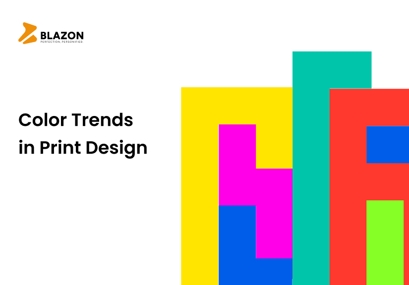
Bold and Vibrant: Color Trends in Print Design
Bold and Vibrant: Color Trends in Print Design
In the ever-evolving world of print design, staying on top of the latest color trends is crucial to creating visually captivating and engaging materials. Colors have the power to evoke emotions, convey messages, and make a lasting impression on viewers. As we dive into the realm of print design, we explore the captivating world of bold and vibrant colors that are dominating the scene today.
To bring your print designs to life with the latest color trends, partnering with the best print design service company is essential. A reputable print design service provider combines artistic expertise with technical prowess to deliver stunning visual experiences. Whether it’s designing eye-catching brochures, attention-grabbing banners, or captivating packaging, their professional touch ensures that your brand shines through.
This blog delves into the fascinating world of color trends, showcasing the shades and combinations that are making waves in print design. When discussing about print design services, a professional from the best print design service company will be more than happy to discuss the latest color trends in print design. In the next section of our blog, we will discuss the bold and vibrant, color trends in print design.
Bold and Vibrant, Color Trends in Print Design
The latest color trends in print design are influenced by a combination of contemporary aesthetics and the evolving preferences of consumers. Here are some of the current color trends:
#1 Earthy Tones
Nature-inspired colors have gained popularity in print design. Shades like warm terracotta, soft greens, and sandy neutrals bring a sense of calmness and authenticity to designs, reflecting a growing appreciation for sustainability and the environment.
Earth tones have made a significant comeback in the world of print design, captivating designers and consumers alike. These colors draw inspiration from nature, reflecting the warmth and richness found in the earth’s elements. From sandy neutrals to deep forest greens, earthy tones bring a sense of grounding and tranquility to any design project.
One of the most notable aspects of earthy tones is their versatility. They can be seamlessly incorporated into various design styles, from minimalistic and modern to rustic and bohemian.
Earthy tones have emerged as a prominent trend in print design, offering a harmonious blend of aesthetics, emotional appeal, and sustainability. Whether used as the main color palette or as accents, these tones bring a sense of balance, tranquility, and connection to the natural world. So, if you’re looking to create a design that is timeless and resonates with your audience, consider incorporating earthy tones to infuse your work with the warmth and beauty of the earth itself.
#2 Pastel Hues
Pastel hues have become a beloved color trend in the world of print design, captivating designers and consumers with their soft and delicate tones. These gentle colors, inspired by the lightness of flowers and candies, bring a sense of sweetness and tranquility to any design project.
One of the remarkable qualities of pastel hues is their ability to create a calming and soothing atmosphere. The subtle and muted nature of these colors makes them perfect for designs that aim to convey a sense of elegance and serenity. Whether used as a dominant color or as accents, pastel hues add a touch of sophistication and refinement to any print design.
Print designers are embracing pastel hues for their versatility and wide-ranging applications. From wedding invitations and baby announcements to fashion lookbooks and product packaging, these colors effortlessly create a dreamy and ethereal aesthetic. Pastel hues lend themselves well to a variety of design styles, whether it’s a romantic vintage theme or a modern and minimalist approach.
Moreover, pastel hues have a universal appeal, evoking feelings of nostalgia and innocence. These colors are often associated with cherished memories and happy moments, making them highly relatable to audiences across different demographics.
#3 Bold and Vibrant Neons
Bold and vibrant hues have taken the print design world by storm, injecting energy and excitement into every project. These vivid and daring colors command attention and make a statement, leaving a lasting impression on viewers. From electric blues to fiery reds, bold and vibrant hues bring a sense of dynamism and playfulness to any design.
One of the notable qualities of bold and vibrant hues is their ability to grab attention instantly. These colors are eye-catching and exude confidence, making them perfect for designs that aim to stand out from the crowd. Whether used as a primary color scheme or as accent shades, bold and vibrant hues create a sense of energy and enthusiasm that captivates the audience.
Print designers are embracing these hues for their ability to evoke emotions and create a memorable visual impact. Bold and vibrant colors can convey a range of emotions, from excitement and joy to passion and determination. By strategically using these hues in designs, designers can elicit specific emotional responses from viewers, enhancing the overall impact of the message.
Moreover, bold and vibrant hues are ideal for designs that target younger and more adventurous audiences. These colors resonate with individuals who seek bold experiences and crave self-expression. Whether it’s a music festival poster or a sports event flyer, bold and vibrant hues add a sense of liveliness and create an atmosphere of fun and excitement.
#4 Moody and Dark Tones
Moody and dark tones have emerged as a captivating color trend in the world of print design, adding depth and intrigue to visual compositions. These rich and mysterious colors evoke a sense of drama and sophistication, creating a captivating atmosphere that draws viewers in. From deep purples to inky blues, moody and dark tones bring a sense of elegance and intensity to any design project.
One of the remarkable qualities of moody and dark tones is their ability to create a distinct mood and ambience. These colors convey a sense of mystery and allure, making them particularly suitable for designs that aim to evoke emotions and leave a lasting impression. Whether used as a dominant color scheme or in combination with lighter shades, moody and dark tones add a touch of sophistication and intrigue to any print design.
Print designers are embracing moody and dark tones for their ability to create a sense of depth and contrast. These colors allow for the creation of visually striking compositions by highlighting certain elements and creating a sense of focus. Whether it’s a brooding poster design or an atmospheric book cover, moody and dark tones provide a captivating backdrop that adds visual interest and draws the viewer’s attention.
Furthermore, moody and dark tones are particularly effective in creating a sense of storytelling. By using these colors, designers can evoke a specific atmosphere or narrative, transporting viewers into a different world or time. The intensity and richness of moody and dark tones add an element of intrigue and depth, engaging the audience and inviting them to explore the visual story being presented.
#5 Retro and Vintage Palettes
Retro and vintage palettes have made a nostalgic comeback in the world of print design, adding a touch of old-world charm and character to modern projects. These color combinations draw inspiration from the past, invoking a sense of nostalgia and evoking the aesthetics of bygone eras. From muted pastels to warm earth tones, retro and vintage palettes bring a sense of authenticity and uniqueness to any design.
One of the notable qualities of retro and vintage palettes is their ability to create a sense of timelessness. These colors have stood the test of time and continue to captivate designers and audiences alike. By incorporating retro and vintage palettes into print designs, designers can tap into sentimental value and evoke a feeling of familiarity and comfort.
Print designers are embracing retro and vintage palettes for their ability to create a distinct visual identity. These palettes offer a rich array of colors that work harmoniously together, allowing for the creation of designs that are cohesive and visually appealing. Whether it’s a retro-inspired poster or a vintage-themed packaging design, these palettes bring a sense of authenticity and personality to the project.
Moreover, retro and vintage palettes allow designers to tap into the current trend of nostalgia and the desire for a connection to the past. In an age of rapid technological advancements, many individuals long for the simplicity and aesthetics of earlier decades. By using retro and vintage palettes, designers can create designs that resonate with this longing and offer a sense of nostalgia and comfort.
Conclusion
It’s important to note that color trends can vary depending on the industry, target audience, and design objectives. Staying updated with current trends and understanding how they align with your brand’s identity can help you create visually compelling and engaging print materials. If you are looking for help with print design services, you can get in touch with Blazon. The team of experts at this best print design service company will help you with your needs.
Reach us now!

© 2023 Blazon All Rights Reserved.

Leave a Reply
You must be logged in to post a comment.